Choosing the right typeface is essential for creating a great user experience on your website. After all, websites nowadays act as the 21st-century storefront, so you’d better make sure things are looking top notch unless you want your customers to run away and – god forbid – do business with the competition.
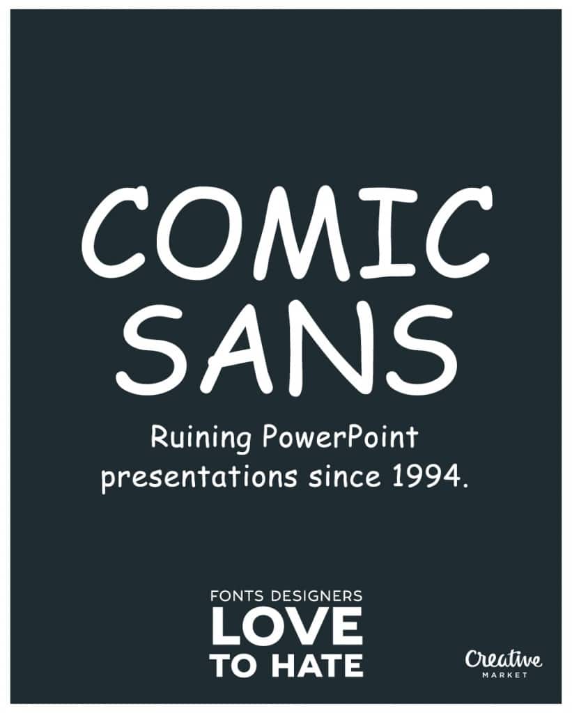
So what makes a good typeface? In a nutshell: readability. Visitors don’t want to have to strain their eyes to read your content, and nor do they want to bother with excessively elaborate, childish, or just plain stupid fonts that are annoying and illegible (think Blackadder ITC, Comic Sans, and Chiller).
Here’s a rundown of typography use statistics and how to choose the right typeface courtesy of the good folks at Smashing Magazine who conducted a study on this very topic:
Headings
We live in a world where most people only read headlines (congratulations on reading this far!), so a heading is quite possibly the most important typeface to get right. It needs to stand out and compel visitors to continue reading.
Smashing Magazine’s 2013 study cited a staggering 51% of headings use sans-serif fonts (such as Arial and Freight Sans Pro) while 47% use serif (such as Georgia and Chaparral Pro; two Jubilant Web personal favorites).
But it’s not just about the style, is it? It’s about size. Effective headings range in size from 20 to 38 pixels.
The body
As with headings, the typeface of the body of your website is important, too. Readability is crucial, so most effective body copy is written in:
- Georgia
- Chaparral Pro
- Arial
- Helvetica
As for size, Smashing Magazine says it has increased over the years since its last such study (only five years ago in 2009!). The size of your website’s body copy should be between 14 and 16 pixels for ultimate readability.
Body Copy Line Length
Ha, you thought it stopped at style and size? Well, you’re in for a few delightful typography facts today. To increase readability on your site, it is also important to consider the length of your copy in characters. Smashing Magazine’s study found that 83.8 characters (not words, characters) per line (at widescreen resolution) is the average line length websites are adhering to these days. This is so they don’t overwhelm readers with too much copy and not enough white space.
Now that you’ve got the basics of typography down, what will you do? Analyze your website and see if you can improve things? If you want a great online resource that identifies the font for you (for any website, competition included) to let you know where it’s at. It’s called Fount. Enjoy.
Jubilant is always here for your SEO New York needs.


